Showing audio progress with waveform images
December 29, 2023
A passion project of mine I’ve been working on recently is https://waveformr.com/. It’s a service that accepts a URL of an audio file and gives you back an SVG of the waveform. You can use it to display audio waveforms like you would an image. Like this:

Code
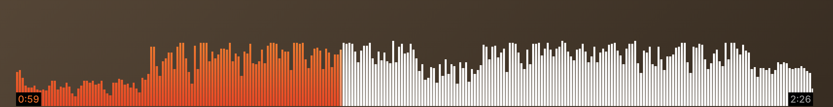
https://waveformr.com/edit?url=https://res.cloudinary.com/dhhjogfy6//video/upload/q_auto/v1575831765/audio/ghost.mp3&stroke=005f73I’ll write more about this service in the future, but for now I wanted to cover a technique for showing progress on an audio waveform, similar to Soundcloud:
Since we’re rendering the audio waveforms as an image, we have to get more creative to achieve the progress visualization.
Enter Clip-path
The secret here is to use CSS clip-path.
If we have two waveform images, we can overlay them on top of each other and use clip-path to get the visual progress that we’re looking for.
Here’s the first attempt:


---
const baseWaveformUrl =
  "https://api.waveformr.com/render?url=https%3A%2F%2Fres.cloudinary.com%2Fdhhjogfy6%2F%2Fvideo%2Fupload%2Fq_auto%2Fv1575831765%2Faudio%2Frest.mp3&type=bars&stroke=c5c1bd";

const progressWaveformUrl =
  "https://api.waveformr.com/render?url=https%3A%2F%2Fres.cloudinary.com%2Fdhhjogfy6%2F%2Fvideo%2Fupload%2Fq_auto%2Fv1575831765%2Faudio%2Frest.mp3&type=bars&stroke=linear-gradient%28EC7546%2C+ED5645%29";
---

<div class="scrubber">
  <img class="base-waveform" alt="" src={baseWaveformUrl} />
  <img class="progress-waveform" alt="" src={progressWaveformUrl} />
</div>

<style>
  .scrubber {
    --played: 50%;
    position: relative;
  }

  .progress-waveform {
    position: absolute;
    top: 0;
    left: 0;
    width: 100%;
    height: 100%;

    /**
     * This is the magic sauce. We use a clip-path to only show the part of the
     * progress waveform that has been played.
     */
    clip-path: polygon(
      /* top left ......... */ 0 0,
      /* top right ........ */ var(--played) 0,
      /* bottom right ..... */ var(--played) 100%,
      /* bottom left .....  */ 0 100%
    );
  }
</style>
The polygon shape tells CSS to “clip” the image to the coordinates we’re drawing.
In this case, we want to clip the image so that it stops at the point where the current time of the audio is.

Assuming we have the current percentage of audio that’s played, we can set that as a CSS custom property and use that as a dynamic way to apply our clip-path.
Going further
What we have is pretty solid, but there was one thing that bugged me. It’s easier to see with different colors.


Here’s a zoomed-in version:
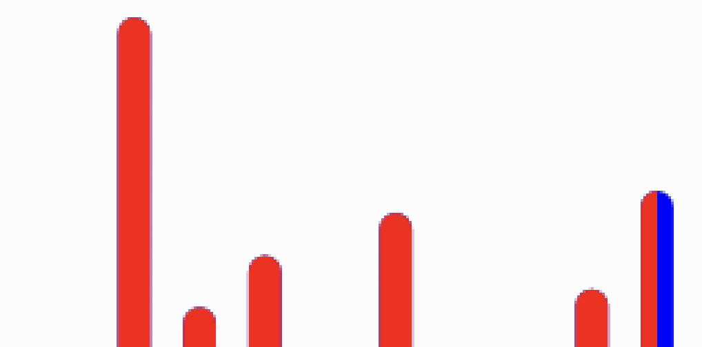
It’s subtle, but the “base” waveform is bleeding through behind the progress waveform.
This makes sense because we’re layering the progress waveform right over the top of the base waveform.
We can adjust this so that there is no overlap by using another clip-path.
---
const baseWaveformUrl =
  "https://api.waveformr.com/render?url=https%3A%2F%2Fres.cloudinary.com%2Fdhhjogfy6%2F%2Fvideo%2Fupload%2Fq_auto%2Fv1575831765%2Faudio%2Frest.mp3&type=bars&stroke=blue";

const progressWaveformUrl =
  "https://api.waveformr.com/render?url=https%3A%2F%2Fres.cloudinary.com%2Fdhhjogfy6%2F%2Fvideo%2Fupload%2Fq_auto%2Fv1575831765%2Faudio%2Frest.mp3&type=bars&stroke=red";
---

<div class="scrubber">
  <img class="base-waveform" alt="" src={baseWaveformUrl} />
  <img class="progress-waveform" alt="" src={progressWaveformUrl} />
</div>

<style>
  .scrubber {
    --played: 50%;
    position: relative;
  }

  .progress-waveform {
    position: absolute;
    top: 0;
    left: 0;
    width: 100%;
    height: 100%;

    /**
     * This is the magic sauce. We use a clip-path to only show the part of the
     * progress waveform that has been played.
     */
    clip-path: polygon(
      /* top left ......... */ 0 0,
      /* top right ........ */ var(--played) 0,
      /* bottom right ..... */ var(--played) 100%,
      /* bottom left .....  */ 0 100%
    );
  }

  .base-waveform {
    clip-path: polygon(
      /* top left ......... */ var(--played) 0,
      /* top right ........ */ 100% 0,
      /* bottom right ..... */ 100% 100%,
      /* bottom left .....  */ var(--played) 100%
    );
  }
</style>
We’re applying the inverse shape to the base waveform so that the two are clipped in a way that avoids overlapping.

Here are the two side-by-side for comparison:
The end result
Here’s the end result using some prettier colors:
Note that this technique is purely for visual progress. For using in a real audio player, make sure to think about accessibility.
Here’s a real-life demo using this technique:

Code for this is here.