UX Case Study: Google Inbox
February 27, 2016
At work we’ve been in the process of building a queue-like component for helping our admins deal with various tasks. As fans of Google Inbox we decided to use it as a reference for many of our UX decisions. It was for this reason that I started down the long and treacherous path of trying to figure out exactly how Google Inbox works. I spent more time than I care to admit wading through compressed and mangle code, so I thought I share the small bits that I learned along the way.
Disclaimer: I’m sure there are things that I’ve misunderstood or missed, so please don’t take each explanation as the complete truth.
The Setup
First, I just want to do a quick run-through of the kind of environment we’re dealing with here. Unfortunately, there is no “one weird trick” to emulate what I saw. It’s a complex choreography of time, CSS keyframes, and a bunch of Javascript.
Like any old site, when you first load the page you’ll get a base payload of CSS and Javascript to get things started. The magic comes when you actually open a message. When this occurs, a new style tag is injected into the page. This style tag has the very specific responsibility of animating each messages on screen to its next position. The exact rules that are supplied will change depending various other bits of information: which message is being open or closed, the dimensions of each message, how many other messages are on the screen, etc. And practically as soon as the style tag is injected, it’s gone.
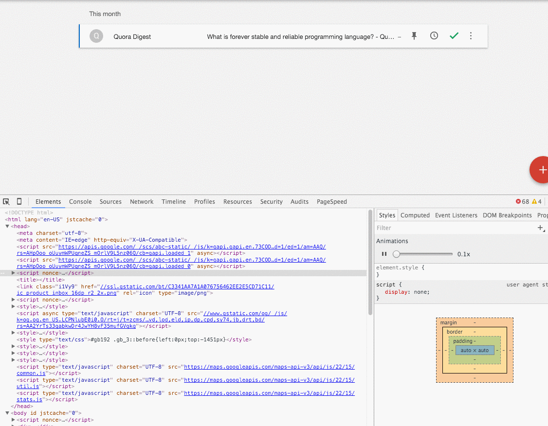
Here’s a sampling of the kind of style rules that are injected:
.t
  .top-level-item[data-item-id-qs="qs-gmail-thread-f-1526179305444074125-0"]
  > .V {
  display: block;
  height: 50px;
  left: 0px;
  opacity: 0.9999;
  -webkit-transform-origin: center top;
  width: 889px;
  will-change: -webkit-transform;
  -webkit-animation-name: swap-close-placeholder-fake-shadow-var-84,
    animation-placeholder-fake-shadow-swap;
}

@-webkit-keyframes swap-close-placeholder-fake-shadow-var-84 {
  0% {
    -webkit-transform: translate(0px, 0px) scale(1.0517435320584927, 27.34);
  }

  80%,
  100% {
    -webkit-transform: translate(0px, 0px) scale(1.0022497187851518, 1.00001);
  }
}

.t
  .top-level-item[data-item-id-qs="qs-gmail-thread-f-1526179305444074125-0"]
  > .U {
  display: block;
  height: 48px;
  left: 0px;
  opacity: 0.9999;
  -webkit-transform-origin: center top;
  width: 889px;
  will-change: -webkit-transform;
  -webkit-animation-name: swap-close-placeholder-var-84;
}

@-webkit-keyframes swap-close-placeholder-var-84 {
  0% {
    -webkit-transform: translate(0px, 0px) scale(
        1.044994375703037,
        28.354166666666668
      );
  }

  80%,
  100% {
    -webkit-transform: translate(0px, 0px) scale(1.00001, 1.00001);
  }
}
Notice that the CSS is targeting specific elements with extremely precise animation measurements. These are not rules that a human would write. These are rules that are most likely generated by an application of some sort. The rules are also armed with exact width and height measurements. If you’ve ever tried to animate height, you’ve no doubt felt some pain as it’s not easy. Knowing the exact height of the element you’re trying to animate makes a huge difference and Google Inbox takes full advantage.
A Few Examples
Now that we have a general idea of the kind of setup we’re dealing with, let’s dive into a few examples.
The Fixed Header
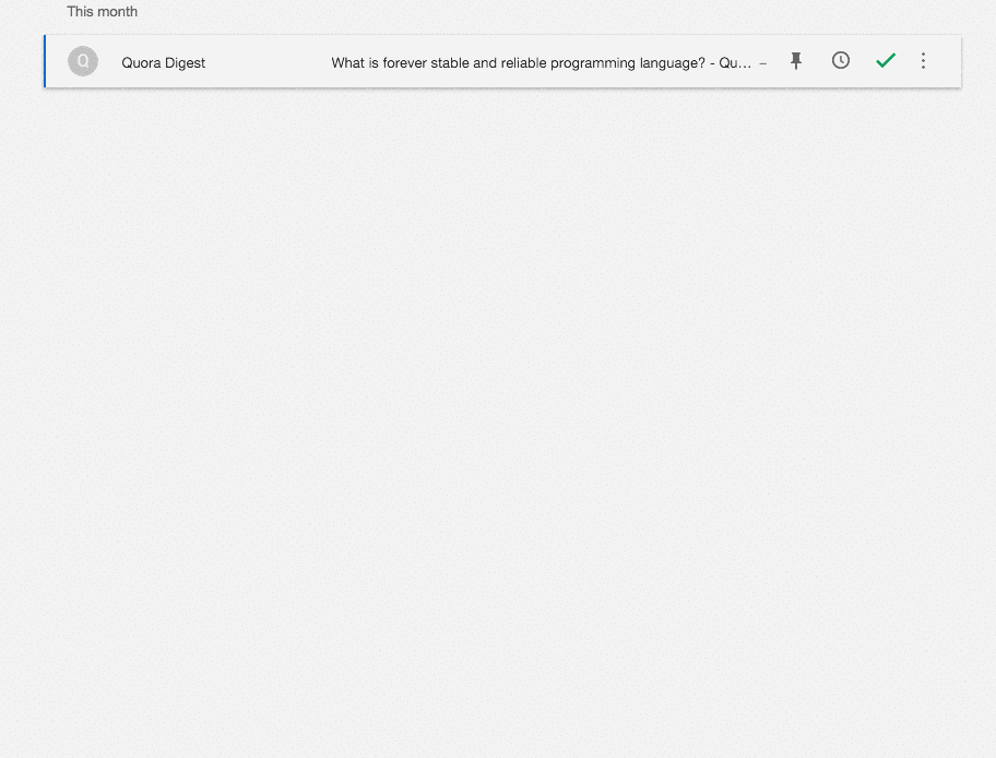
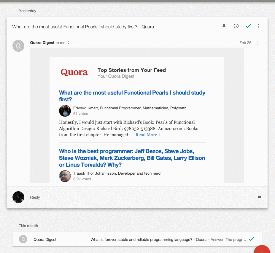
We’ll start with the simplest of the three: the fixed message header. This one is not particularly novel, but has a slight twist to make it interesting. The basic idea is that when a message is open, it’s header sticks to the top of the page as you scroll past it:
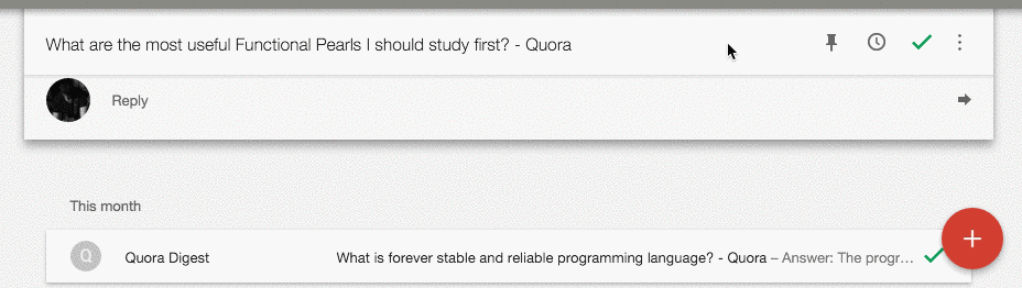
This is done pretty much as you might expect. Javascript listens for the position of the top of the header message and once it’s been scrolled past the top the of the viewport, its position is fixed. A small detail here is that there is also a “pusher” div that makes sure to push the message contents down once the message header is fixed. This is needed because a fixed element removes it from the flow of the page, so the contents below it would have otherwise popped up. Here’s what I mean:
The twist is that the header will also switch to absolute positioning once you get to the point where the bottom of the header is the same as the bottom of the message. This gives a nice transition between fixed back to static, rather than just jumping straight back to static.
I’ve put together an example implementation on Codepen:
The Message Open
Now things get a bit trickier. First, a quick visual of the animation:
While this might look like a simple height and width animation, I assure you it’s not. What’s happening here involves timing a few different keyframe animations together as one. Keep in mind that the actual contents of the messages are completely hidden while the message is closed, as in display: none.
First, there is a div in the markup that’s sole purpose is to do a scale animation when the message is opening. A scale animation is an interesting choice because it has no effect on the document flow, meaning that you can scale an element to 200% and the elements around won’t budge. So in order to give the effect that the height of the message is increasing as the message is opening, you have to actually translate any messages below it down the page. This will be more relevant in the next section. The scale animation is also interesting because it’s essentially emulating a height animation of sorts. The “pusher” div scales to the point where its height is exactly the height of the incoming message content. This is where knowing the exact dimensions comes in handy.
Once the “scaler” div has done its thing, the content is brought into the DOM and begins to fade in. At this point, the flow of the document is restored and since everything was done to exact specificity, there’s not jumpiness with any other div’s that had been moved out of the way for the scale animation.
I’ll be going into more detail next about the translating, but here’s a sample implantation on Codepen:
See the Pen Google Inbox - Open Message by Nick Ball (@npbee) on CodePen.
The Message Swap
Now we get to the wild and crazy stuff, the message swap:
So, why is this interesting? To be honest, I wasn’t sure it was all that interesting myself until I actually tried implementing it. The first thing to notice is that it looks as if the opening message is animating its height in reverse. This is the what a natural height animation would look like. If you were to animate the second message’s height normally, it flow downwards increase the overall height of the page. The second interesting thing that’s not very visible in the above gif, is the scroll position.
Take a look at this one (I have to speed up the animations for this to work):
In this gif, I’ve already scrolled way down the page and I’m now opening the second message. If you imagine what would happen in the normal document flow, the first message would close and the page’s height would be substantially decreased, bringing the element below with it up the page. We’d open to somewhere in the middle of the second message. Instead, the scroll position appears to stay the exactly the same, the first messages closes, and the second message opens right in place. This is an example of a completely natural feeling animation that is extremely unnatural to implement.
So how’s it done? In short, the CSS translate transform. But this is also another example of multiple animations being coordinated together to appear as one smooth interaction. As the first message is closing, it’s translateY position is being animated from 0 up to the point where it would be visible on the screen at the current scroll position. Meaning, if the first message were above the viewport by 200px, we’d animate from translateY(0px) to translateY(200px) to bring it in view. Simultaneously, the second message’s translateY property is animated from the offset created from the first message closing down to the point where it needs to end up on the screen. All the while each message’s “scaler” divs are doing their thing. All of this put together makes it look these divs are basically animating their height without the page moving at all.
But just those animations wouldn’t be enough. The last missing piece here is the scroll position. In this scenario, once we’re done animating we’ve actually translated all of the content forward with the translateY property. So technically you could scroll up in the page and see a bunch of blank space. And since these animations are only temporary (remember the style is injected and then removed once the animations are done), the page contents will jump up once styles are removed because they don’t have the translateY values that were applied. This is obviously no good. The solution is to manually set the scroll position forward the exact amount that the page contents were translated. Because we’re dealing with exact calculations, doing this immediately before the injected styles are removed does not result in any page jumps and essentially resets the page to a fresh state.
I’ve tried to narrow down the concepts to an implementation here (click the second message):
See the Pen Google Inbox - Message Swap by Nick Ball (@npbee) on CodePen.
Notice the two messages translating up and down and the scroll bar hopping up at the very last second once the animations are done.
In attempt to make this more clear, I’ve made a step-able version here:
See the Pen Google Inbox - Message Swap Stepper by Nick Ball (@npbee) on CodePen.
Note that I’m calling these “steps” but really these all happen pretty much simultaneously.
Takeaways
I’m sure you’re wondering why I wasted so much time on this. I wondered that myself plenty of times, but came away with a few solid learnings:
Debugging Google code is hard.
Like any quality production app, Google Inbox’s output code is not meant to be readable. But Google really seems to go the extra mile with minified class names and injected style. They are building for scale and not for people like me to be able to decipher what’s happening in their web apps.
Subtlety is king.
Most of the animations are incredibly subtle. Like really subtle. They are the sort of animations that you don’t really know are there until you do. Additionally, many of these animations have a very fast duration. So after all of the work to achieve these animations, they’re gone in an instant. I think it’s a nice display of restraint by the designers. In the same situation, I could see myself wanting to show off all of these wonderful animations I had built.
On the flip side of the above, I did see a bunch of injected code that was essentially worthless. I doubt that animating a div from translateY(0, 0.000122) to translateY(0, 0.00011) is actually perceivable to a real person. The amount of times where these extremely small animations are introduced, I’m not sure, but there is probably a tradeoff there somewhere.
Google takes their animations seriously.
I don’t consider myself well-versed in UX design, but it was quite fascinating to see just a glimpse of the amount of work it takes to get the level of polish that Google Inbox has. As I mentioned earlier, there are probably some non-humans writing at least part of the actual code that makes the animations run, but there are definitely humans designing the animations. The interactions seemed to be envisioned first with the implementation details worked out later in whatever way was necessary, which is opposite of how I usually think about these things. I’m not sure I’ll ever have the resources at my disposal to build animations at this level of detail, but it was an impressive reminder that user experience is the ultimate goal and we should do whatever it takes to make it great.